Configuration
ExtraAttributes Classification Plugin
The ExtraAttributes and ExtraDocAttributes implement the inPoint IClassification Plugin in order to extend the standard Forms, and are also extensible with their own Plugins (in fact, almost everything inside the ExtraAttributes is implemented as a Plugin).
The ExtraAttributes Classification Plugin:
- can be used either for Folders (ExtraAttributes) or Documents (ExtraDocAttributes)
- supports an unlimited number of Attributes
- support multiple types (aka EditorControl – built-in or extensible)
- each loading/saving data from any DataSource (built-in or extensible)
- supports fields Validators (built-in or extensible)
- supports Expressions (e.g. for Readonly or Required flags)
- show a custom Layout (with groups, tabs, columns, etc...)
Setup
The ExtraAttributes Classification plugin is part of the core installation and resides inside the inPoint.Plugins.dll so you only need to add to your chosen Format:
- Create a new ElementFormat (or New Folder with new Element Format)
- In the Plugins Tab, click the + Button (on the right) to add a new Plugin
- Choose the ExtraAttributes or ExtraDocAttributes
- Check the Box under the column „Enable“ (otherwise it will not be visible)
- Click the gear Button (on the right) to open the ExtraAttributes Configuration Dialog
Editors
Editors (aka EditorControls) are the visible part that let the user interact with a certain Attribute.
Each Attribute can only have one EditorControl, and their functionality greatly varies.
inPoint comes with a pre-defined set of EditorControls, but it’s „easy“ to extend and create new ones.
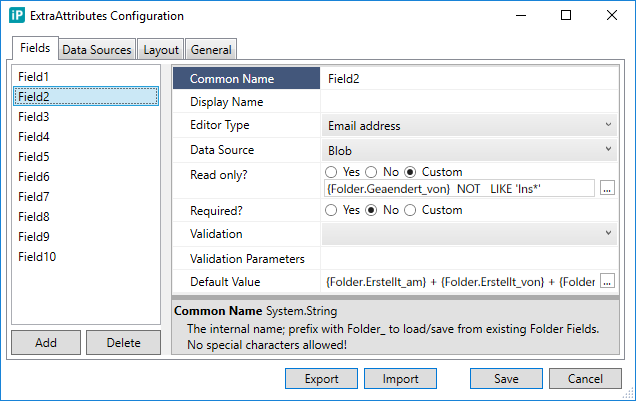
Common Attributes
Common Name*
Identifier (no spaces nor special characters, must begin with a letter)
Display Name
The label to show to the user. If none set it will convert adjust the Common Name (replace _ with spaces, capitalize letters) Wnter one space to „hide“ it (e.g. for Grids)!
Editor Type*
Default: Text
Which editor to use
Editor Parameters
Wach Editor has it’s own set of properties
Data Source*
Default: Blob
Storage of this attribute’s value(s)
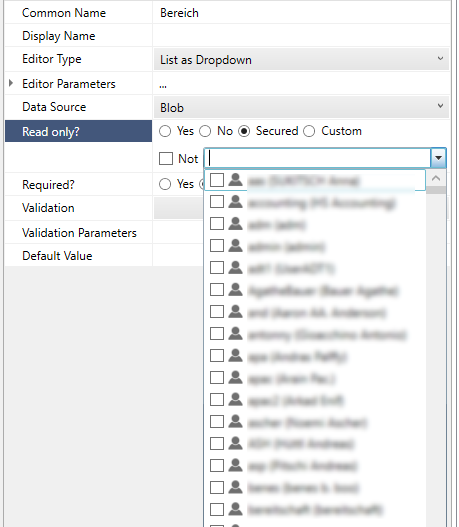
ReadOnly*
Default: No
Whether the user is allowed to edit this; can specify an Expression to be evaluated only at startup (no dynamic evaluation)
Required*
Default: No
whether a value is required; can specify an Expression to be evaluated only at startup (no dynamic evaluation)
Validation/Validation Properties
Which Validation Plugin to use
Default Value
Which value to initially assign
Editor Types
For a complete list of all available Editors see Editors
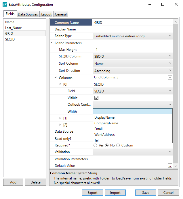
Lookup Repositories
A Lookup Repositories is basically a custom user-specified SQL Table (inside the inPoint DB Default Schema) that MUST include at the bare minimum 3 columns
Columns
SEQID
pkey, int, auto, not null
SequenceID to identify the Row automatically set by the DB
PARENTSEQID
int, null
SequenceID or the parent row
VALUE
nvarchar, null
The display value
You can add any custom column you wish. Such a Table is then either imported (or optionally created from scratch) using the inPoint.Admin (see external documentation) – only then it can be used in inPoint as a Lookup Repository.
Such a Repository can then be used:
- To feed values to a selection list (e.g. Lookup RepositoryId (pre-defined))
- As datasource for the Grids (GridRepository and LinkedGridRepository)
Note that there is no type mapping between ExtraAttributes values and the columns – it’s your responsibility to make sure Text data is used in nvarchar columns, Date in DateTime and so on...
Editors Advanced Topics
Input Masks for Text / Numbers
https://www.infragistics.com/help/wpf/xaminputs-masks
| Mask Character | Title | Use with: | Description |
|---|---|---|---|
| # | Digit placeholder | xamCurrencyInput xamNumericInput xamMaskedInput | Characters must be numeric (0-9) and entry is required. Example: (###)-###-#### |
| . | Decimal placeholder | xamCurrencyInput xamNumericInput xamMaskedInput | Characters are required as specified as the decimal placeholder as defined by the system’s international settings. Characters are treated as literals for masking purposes. |
| , | Thousands separator | xamCurrencyInput xamNumericInput xamMaskedInput | Characters are delimited by the thousands separator as defined by the system’s international settings. This character is treated as a literal for masking purposes. |
| : | Time separator | xamMaskedInput | Characters are delimited by the time separator as defined by the system’s international settings. This character is treated as a literal for masking purposes. |
| / | Date separator | xamMaskedInput | This character is also treated as a literal for masking purposes. |
| \ | Escape next chatacter | xamMaskedInput | This character instructs the mask to treat the next character in the mask string as a literal. This allows you to include the #, &, A, and ? as well as other characters with special meanings in the mask. This character is treated as a literal for masking purposes. |
| & | Character placeholder | xamMaskednput | Valid values for this placeholder are ANSI characters in the following ranges: 32-126 and 128-255 (keyboard and foreign symbol characters). |
| > | xamMaskedInput | Converts all characters that follow to uppercase | |
| < | xamMaskedInput | Converts all characters that follow to lowercase | |
| A | Alphanumeric character placeholder | xamMaskedInput | Represents an alphanumeric character. For example: a-z, A-Z, or 0-9. Character entry is required . |
| a | Alphanumeric character placeholder | xamMaskedInput | For example: a-z, A-Z, or 0-9. Character entry is not required . |
| 9 | Digit placeholder | xamCurrencyInput xamNumericInput xamMaskedInput | Character must be numeric (0-9) but entry is not required. |
| h | Hexadecimal digit placeholder | xamNumericInput xamMaskedInput | Character must be a hexadecimal digit (0-9 or a-f). The entry is required. A-F digits will be converted to lower case. |
| H | Hexadecimal digit placeholder | xamNumericInput xamMaskedInput | Same as h placeholder however the a-f digits are converted to upper case. |
| - | Minus sign (optional) | xamCurrencyInput xamNumericInput xamMaskedInput | Minus sign when followed by a number section defined by series of n’s (like in "-nn,nnn.nn") indicates that negative numbers are allowed. When not followed by a series of n’s, it’s taken as a literal. Minus sign is only shown when the number is actually negative. |
| + | Plus sign (optional) | xamCurrencyInput xamNumericInput xamMaskedInput | Plus sign when followed by a number section defined by series of ns (like in nn,nnn.nn) indicates that negative numbers are allowed. However, it differs from - in the respect that it always shows a '' or a - sign depending on whether the number is positive or negative. |
| C | Character or space placeholder | xamMaskedInput | Character entry is not required. This operates exactly like the & placeholder, and ensures compatibility with Microsoft Access. |
| ? | Letter placeholder | xamMaskedInput | For example: a-z or A-Z. Character entry is not required. |
| n | Digit placeholder | xamCurrencyInput xamNumericInput xamMaskedInput | A group of n’s can be used to create a numeric section where numbers are entered from right to left. Character must be numeric (0-9) but entry is not required. |
| {char:n:s} | Arbitrary set of accepted characters | xamMaskedInput | The {char:n:s} mask allows you to define a placeholder with arbitrary set of acceptable characters. The n in the mask specifies the number of character placeholders in the mask. The s specifies the set of acceptable characters. The following are some examples of this mask: {char:1:abc} - This mask will have single character placeholder that will accept a, b or c characters only. {char:4:abc} - Same as above except 4 character placeholders is created. {char:8:0-9a-f} - 8 character placeholders where each will allow 0-9 and a-f characters (in effect hexadecimal characters). |
| mm, dd, yy | Date characters | xamMaskedInput | The combination of these three tokens is used to define a date mask. The mm is for month, dd for day, yy for two-digit years and yyyy for four-digit years. Examples: mm/dd/yyyy, yyyy/mm/dd, mm/yy. |
| hh, mm, ss, tt | Time characters | xamMaskedInput | The combination of these tokens is used to define a time mask. The hh is for hour, mm for minute, ss for second, and tt for AM/PM. Examples: hh:mm, hh:mm tt, hh:mm:ss. |
| {date:<n>} {time:<n>} | Date and Time | xamMaskedInput | The {date:<n>} and {time:<n>} tokens are placeholder for formatting date and time using the underlying culture settings. <n> can be: d Short date format g Short date, short time (excluding seconds) G Short date, long time (including seconds) t Short time (excluding seconds) T Long time (including seconds) |
| {dateTime:<n>} | Date and Time | xamMaskedInput | The {dateTime:\<n\>} token is a placeholder for formatting date and time using the underlying culture settings. <n> can be: d Short date format g Short date, short time (excluding seconds) G Short date, long time (including seconds) t Short time (excluding seconds) T Long time (including seconds). R RTC Timesamp with date and time in GMT |
| {double:-i.f:c} | Customized floating poing input | xamNumericInput xamMaskedInput | The {double:i.f:c} token is a placeholder for a mask that allows floating point input where i and f specify the number of digits in the integer and fraction portions respectively. The :c portion of the mask is optional and specifies that the value must be continuous across fraction and integer portions. For example, with :c in the mask, in order to enter 12.34 the user types in "1234". Notice that the decimal separator character is missing. This alleviates the user from having to manually type in the decimal separator. The "-" (minus) symbol before i.f is also optional. Presence of ‘-‘ symbol indicates that the negative values are allowed. If ‘-‘ symbol is not included then only non-negative values will be allowed. |
| {currency:-i.f:c} | Customized currency input | xamCurrencyInput | Same as {double:i.f:c} except the mask is constructed based on currency formatting information of the underlying format provider or the culture. It typically has the currency symbol and also displays the group characters. |
| {number:min-max} | Range of numbers | xamCurrencyInput xamNumericInput xamMaskedInput | The {number:min-max} placeholder is used for a number section that can accept values in the range from min to max. Examples: {number:0-255}, {number:-10-10}. |
| Literal | All input controls | All other symbols are displayed as literals; that is, they appear as themselves. |
NOTE: You can also escape the mask with {LOC} character sequence to indicate that symbols in the following table should be mapped to the associated symbols in the underlying culture settings.
| Mask Character | Description |
|---|---|
| $ | Currency symbol |
| / | Date separator |
| : | Time separator |
| , | Thousands separator |
| . | Decimal separator |
| + | Positive sign |
| - | Negative sign |
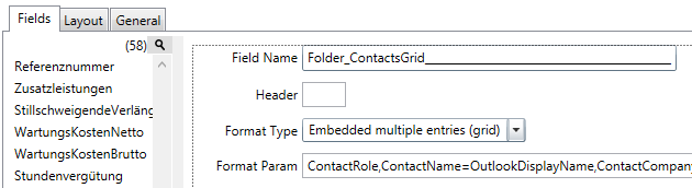
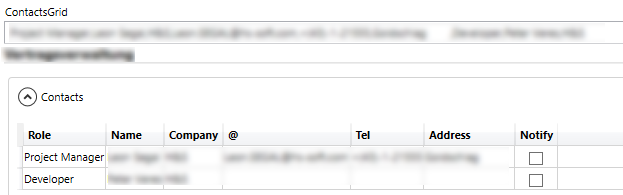
Outlook Contacts
Allows Drag&Drop of an Outlook Contact directly on the Grid and will fill out accordingly.
For each column in the Grid you can setup the Outlook Contact field mapping.
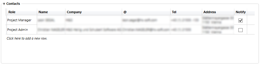
Single/Multiple select rows, and context menu “Send Email” will open the DocTemplates Email Templates, if any files are selected in the current DocList then those will also be attached.
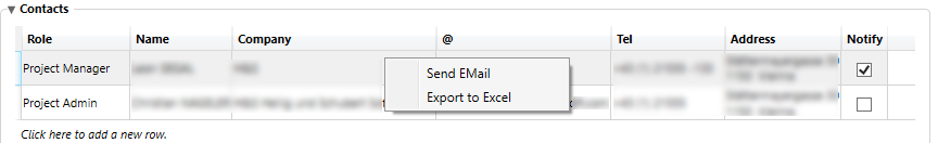
“Export to Excel” will export the whole Grid to an Excel file saved locally (path chosen by user).
Grid Summary (Fulltext indexing)
You can now use the Folder_ prefix for Grids (linking to a standard Folder Text Attribute), which fills the Folder attribute with a text summary of ALL grid contents – basically allowing you to index the grid’s contents as a whole (in case it’s marked for Search).
Expressions and the Expression Builder
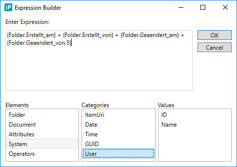
Expressions are an „easy“ way to replace an hard-coded value and add some logic to be evaluated at run time.
An Expressions is made up of:
- Tokens: evaluated and replaced on runtime, can be
- References to other Attributes
- References to any Folder/Document Field
- Dynamic Values (like the current Time and/or Date, ItemUri)
- User properties (like his name or id)
- Unique GUID
- Arithmetic Operators: add,subtract,multiple,divide
- Comparision Operators:
=,<>,<,<=,>,>=,IN,LIKE - Logical Operators:
And,Or,Not - String Operators:
Length,IsNull,Substring,Trim,IIF
You can either type this directly by yourself (there is also a Token helper for that), or show the Expression Builder Dialog which will list all available Tokens and Operators.
Boolean Expressions
Return a True or False value (e.g. for IsReadonly or IsRequired properties)
Text Expressions
Return a Text made up of Tokens to be further used
NOTES:
- In order to avoid user confusion, there are no detailed error messages Dialogs to the user when an Expression Evaluation error occurs – those are only visible in the Debug log
- Be wary of invalid/missing values – if a Token cannot be found it will be removed which might cause unexpected results in the evaluation
Required/Readonly Expressions
You can now set the Required and/or Readonly flags for any Editor to be an Expression; this will be evaluated at startup only (no dynamic changes).
Security based expression
Example: Required Expression based on a Checkbox
Use Case: have the selection of a checkbox affect another attribute‘s Required property.
NOTE:
a Checkbox has 3 states: Unset, True and False so you need to either:
- Set a Default value of True or False
- Handle the Unset state in the Expression (which also results in a True or False)
Setup
Field1 is a Checkbox, Field2 is Text.
Field2.Required set to Custom with the following Expression:
IIF( LEN({Field1}) = 0, False, {Field1}) <> False
In this case if the Checkbox is unset (length = 0) we‘ll handle it as a False.
That is then compared and if NOT False, the whole Expression will return True.
So to summarize, if Field1 (the Checkbox) is:
- Unset – will return false
- True – will return true
- False – will return false
Default Value
You can now set a default value to any Editor:
- If it’s a checkbox/toggle (boolean), you can use True or False
- To use a string you must quote it in single quotes
- You can enter an Expression to be evaluated on startup (no dynamic changes)
- In case of a Multiple selection, you can also set multiple default values (CSV – comma separated)
Grid Control Button Bar
A Toolbar to allow the User to manage the Master/Details View

Parameters
Grid
Select an existing Grid which this ControlBar should reference
Clear
Whether to show the „Clear Details View“ button
Add
Whether to show the „Add as new“ button
Add Link
Whether to show the „Add as Link“ button
Add Link
The „Grid Control Bar – AddLink Dialog“ Editor to use
Delete
Whether to show the „Delete“ button (Delete is always available by the keyboard Del button or right-clicking in the Grid)
Export / E-Mail
Whether to show the extra actions (related to the Grid itself)
Grid Control Bar – AddLink Dialog
This Editor is required when using the Master/Details view in combination with the LinkedGridRepository and will show a Dialog for the User to choose an existing row for „adding as a link“ to the current Master View.
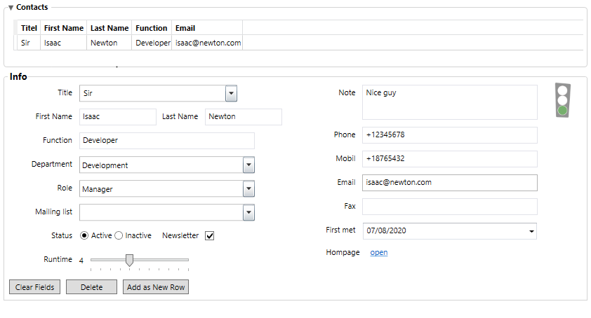
Master/Details View
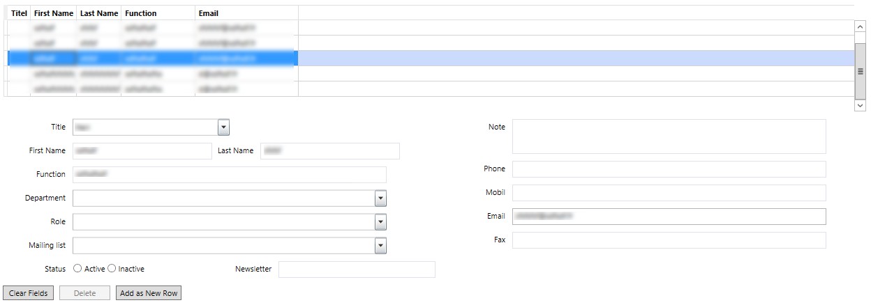
Master/Details views are used, if a grid and a detailed view (of fields) is needed for editing.
Components
It contains 2 components:
- The grid for showing data in a table form
- The fields for detail view and editing
Setup
First you have to define a grid with all your column fields. (see Embedded multiple entries (grid)).
Afterwards you can add the fields you have used for the column configuration to the layout (as normal fields - see Layout).
NOTES:
- The Grid must be READONLY – no editing in place allowed
- The Grid must contain ALL columns – otherwise the load/save will miss those – you can hide specific ones in the Column configuration
- GridRepository vs LinkedGridRepository
Multiple Selections
The List* Family of Editors supports multiple selections; the value will then be converted into a CSV list showing up as Text.
There is currently no support for splitting those in the Document Lists, Filtering or Fulltext search.
Validation
ExtraAttributes fields allow you to specify two settings regarding validation:
- a Validation Plugin (a list of all available plugins will be shown)
- a Validation Parameter
Note the difference between a Validation and an Input Mask
- a Validation will allow the user to enter any value, but will show a red border (and a Validation warning) if the value fails validation; in this case the Save button will also be disabled
- an Input Mask will NOT allow the user to enter anything that wont match the Mask, and will revert to the previous valid value if the value fails
RegularExpressionValidationRule
The „RegularExpressionValidationRule“ accepts a regex as parameter which will be evaluated against the value.
OnlineIBANValidationRule
The „OnlineIBANValidationRule“ doesn't need an parameters. IBANs will be validated against https://openiban.com
NOTE: In case of an error / not reachable website, an error popup will be shown.
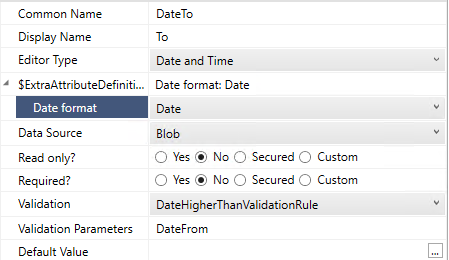
DateHigherThanValidationRule
The „DateHigherThanValidationRule“ accepts the name of an date field as parameter. A localized error message will be shown in the form, e.g. (german):
Localization
Attribute’s DisplayName
In the ExtraAttributes Configuration Window, under the tab "Localizations" all translations for all supported Languages can be done. For each ExtraAttributes Field one Row is shown in the Grid. The Fallback language will be always German!
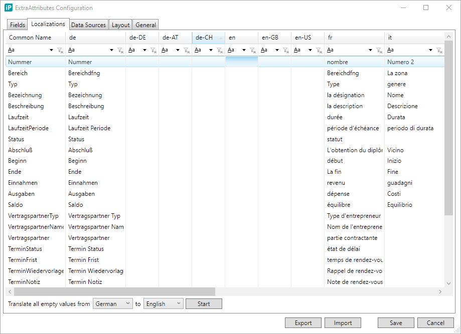
On the bottom left of this Window there is the possibility to automatically translate from one Language to any other. First i recommend to fill out one localization for one Language complete manually. Then choose this Language as "From" and select the Language the system should translate "to". After click on "Start" all empty "to" Language values will be translated using Google Translator. After every automatic translation the values can be edited manually as well!
Layout
Form Title, Captions, Box‘s titles are under discussion.
Layout
Empty
All the Attributes will be automatically be shown (one per row)
CSV Layout
You can use the „Name“ of the Attribute to specify which ones to show.
You can show multiple Attributes on the same row by separating them with a comma (that’s why it’s called the CSV Layout).
ONLY the Attributes you are including will be shown.
Rows can either start with:
#-> title_-> separatorName of Attribute;you can change the default length by settingname=pxWidth
XML Layout
This is by far the most advanced layout which allows groups, tabs, columns, etc...
Note that this is not real XML, since:
- Names are case-insensitive
- Values are case-insensitive
- There is no XML validation – any errors and the Form will not show
- ... but still requires close tags!
Follows a very basic structure:
- On the top the
<layout>tag - Then as many as you wish
<box>tags
Inside each <box> you can either:
- nest more
<box>tags (as deep as you want) - specify a CSV Layout (enclosed in
<csv>tags) - create layout columns using the
<cols>element, each child<box>then becomes a Column
The <box> tag has many properties (some specific to the Type), the only ones
shared across all:
- Type: specifies the type of the Box
- Name: identifier (used to reference this Box)
Currently following <box> Types are supported:
- clear – no border and NO header (used for layouting)
- border – frame (thin border) with NO title
- expander – user can expand/collapse
- isOpen=true/false to set default state
- title to set the header
- groupbox – framed (thin border) with title
- title to set the header
- tab to specify a Tab host
- isFullscreen=true/false when only one Tab host is used and it should fill the whole screen (scrollbars are then only scrolling the inside area and not the whole page)
- tabItem (only inside
<box type=“tab“>) per TabisSelected=true/falseto set default tab (last one selected „wins“)- title to set the header
Layout Boxes Configuration
A special EditorControl called „Layout Boxes Configuration“ allows you to
dynamically show/hide a whole <box> section by evaluating an Expression.
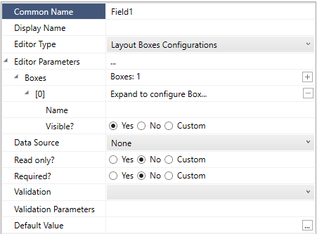
In order to set it up:
- Name the
<box>you would like to dynamically show/hide - Add an Attribute using the EditorType: „Layout Boxes Configuration“
- Expand the Editor’s Parameters and add a Box item:
- Configure the name (as above)
- Configure the Visible property: set to Custom and enter an Expression
- Add it somewhere to your layout (even though it has no visual output)
NOTES:
- these are dynamic and evaluated in real-time
- if hidden a box will not take up any space; if shown it will take as much as it needs (so scrollbars might appear)
- if all TabItems are hidden in a specific Tab host, the Tab host itself will also be hidden
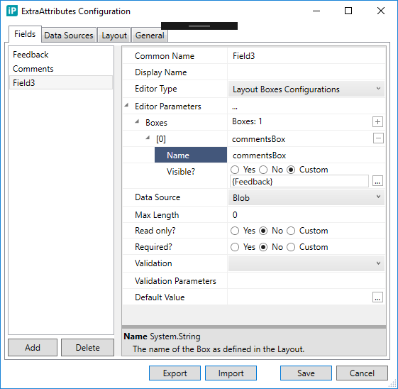
Example: GroupBox visibility based on Checkbox
Use Case: a Feedback checkbox – once checked the a Comments field will be visible
Setup
- Rename Field1 to „Feedback“, set EditorType to „Boolean as Checkbox“, DefaultValue to „False“
- Add Field2 and rename to „Comments“, set EditorType to „Memo“
- Add Field3, set EditorType: „Layout Boxes Configuration“, expand Editor
Parameters and set:
- Box name: „commentsBox“
- Visibile: Custom, Expression:
- {Feedback}
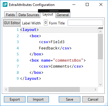
Layout
<layout>
    <box>
        <csv>
            Field3
            Feedback
        </csv>
    </box>
    <box name="commentsBox">
        <csv>
            Comments
        </csv>
    </box>
</layout>
Example CSV Layout
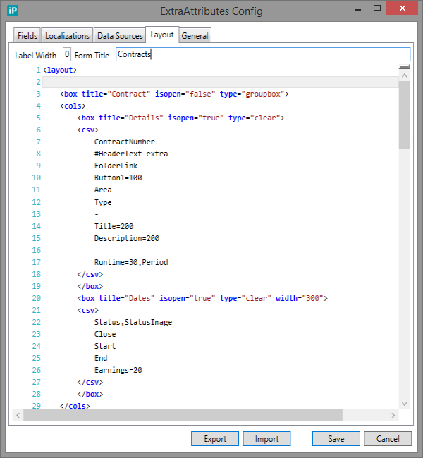
Example Tab Layout
NOTE: starting 2018.1 the Tab layout has been simplified and now looks like this: (no more special Tab/TabItems – only new Box types)
Layout
<layout>
    <box type="tab" isFullscreen="true">
        <box title="Contacts" isSelected="true" type="tabItem">
            <csv>
                GRID_CONTACTS
                GRID_CONTACTS_COMMANDBAR
            </csv>
        </box>
        <box title="Contact Details" type="tabItem">
            <csv>
                SEQID
                ANREDE,TITLE
                FUNCTION
                DEPARTMENT
                ROLE
                COMMENT
                STATUS
                NAME,LAST_NAME
                TEL_WORK,TEL_MOBILE
                EMAIL
                COMPANY,ADDRESS
                GRID_CONTACTS_DETAILS_COMMANDBAR
            </csv>
        </box>
    </box>
</layout>
Box type „Tab“ Properties (the host for all TabItems):
- Name (optional): box identifier
- isFullscreen (optional, default:
false): when this Tab host is the ONLY one in whole layout (no inPoint Classification, etc…) the scrollbar will be WITHIN the tabItem and not outside – meaning the Tabs themselves will stay in place while scrolling - NOTE that this Box can ONLY include Box type=”TabItem”!
Box type “TabItem” Properties (each individual Tab):
- Name (optional): box identifier
- isSelected (optional, default:
false): whether this Tab should be pre-selected when first time loading
DataProviders and Sources
ExtraAttributes supports multiple Data Sources, meaning it can load/save ANY of it’s Attributes from a different data source. The way this works;
- inPoint provides a default set of „Data Providers“
- you then define a „Data Source“ that uses any of those „Data Providers“ and any addition configuration as required
- each Attribute can then reference a „Data Source“
Every DataSource can be set as READONLY to (optionally temporarly) disable any saving (loading would still work). They are executed alphabetically (based on their name) – the last one „wins“.
There are 2 major kinds of DataProviders, those that:
- provide ONE row of Data – for example to map to a certain Attribute (Repository, ExternalSource)
- provide MULTIPLE rows of Data – for example to fill a Grid (GridRepository, LinkedGridRepository)
- some can handle both – like for example the Blob or ItemFields DataProviders
Note that most of them use Lookup Repositories for the Back-end (so require some setup), the ExternalSource is currently the only one that can query any SQL Table.
Folder_* and Document_*
In previous versions we added the feature that if the CommonName of an Attribute starts with the prefix „Folder_“ then the loading / saving of the value will be applied to whichever Folder attribute exists with the same name. That enabled use cases like:
- Grid Summary (Fulltext indexing)
- Fulltext indexing of any ExtraAttributes (since those are not yet included in the normal FT Index)
- Pre-loading values from the back-end
- Accessing values set from ExtraAttributes (since only BLOB storage was used)
Today we have the ItemFields DataSource that allows you the same without re-naming your attributes.
SearchValue and EditValue
Those parameters are used throughout the DataSources and allow to configure how the VALUE column in the LookupRepository is filtered (when loading data) or filled (when saving/updating data).
They can now also be evaluated as Expressions.
Data Providers
For a complete list of all pre-installed Data Providers see Data Providers.
General Settings

Name
Allows you to define folder names by ExtraAttribute fields.
Example
{Field1} - {Field2}